Brochure Set
3 Brochure set for the Anderson Japanese Gardens
Objective:
Design a set of brochures for a chosen museum or attraction. Develop a unified visual system for the brochures without making each piece indistinguishable from each other.
Final Output


Primary Brochure
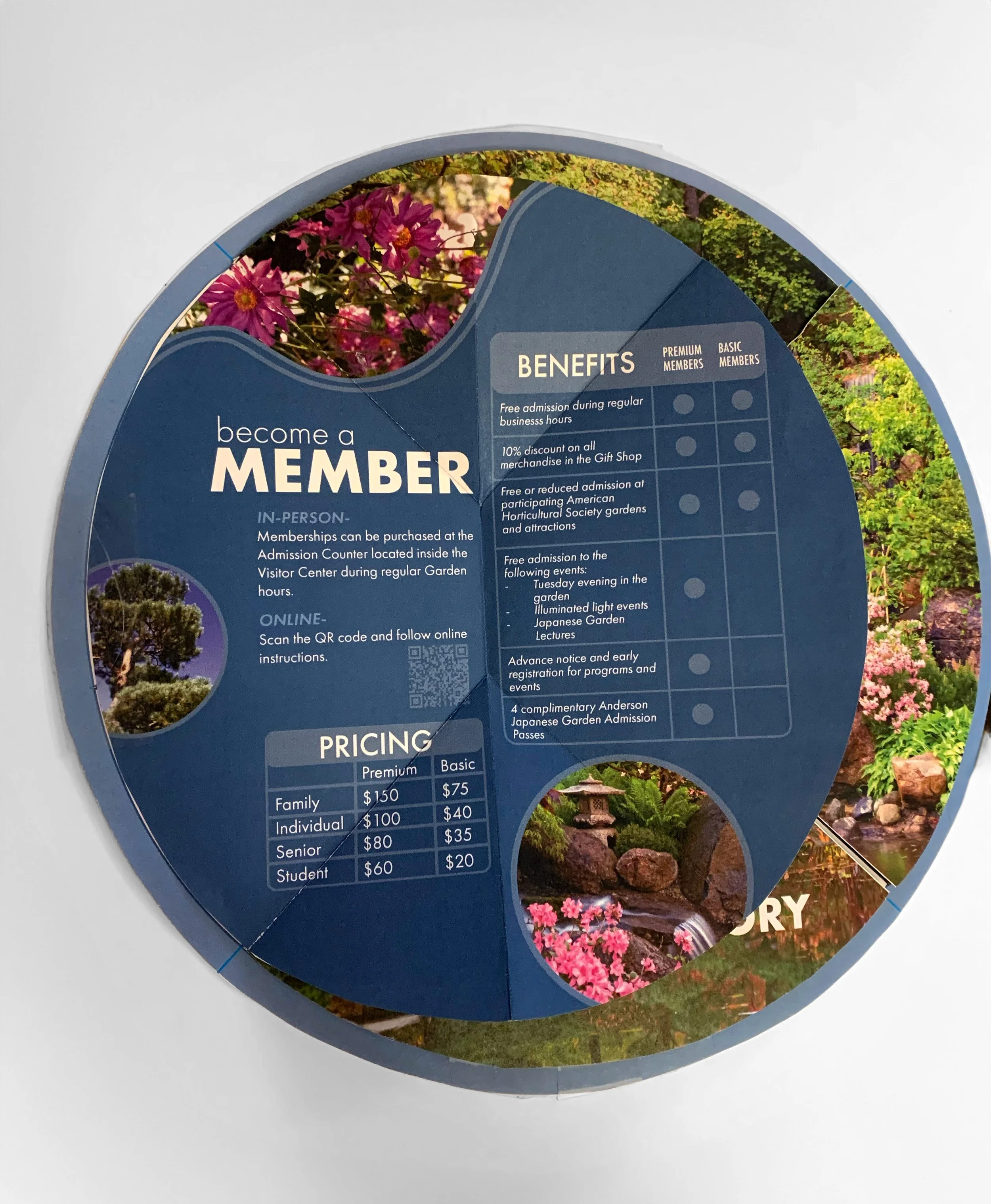
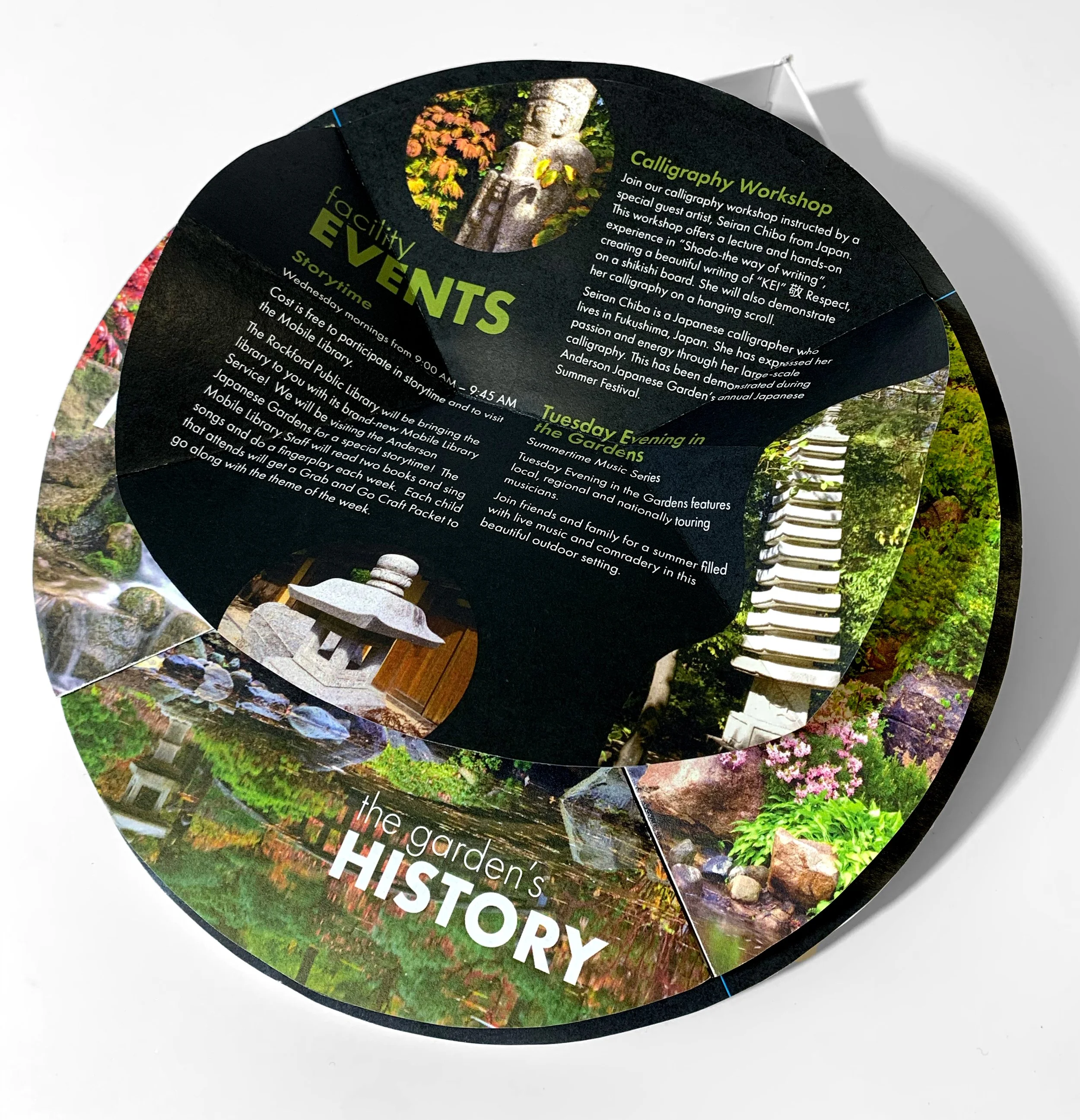
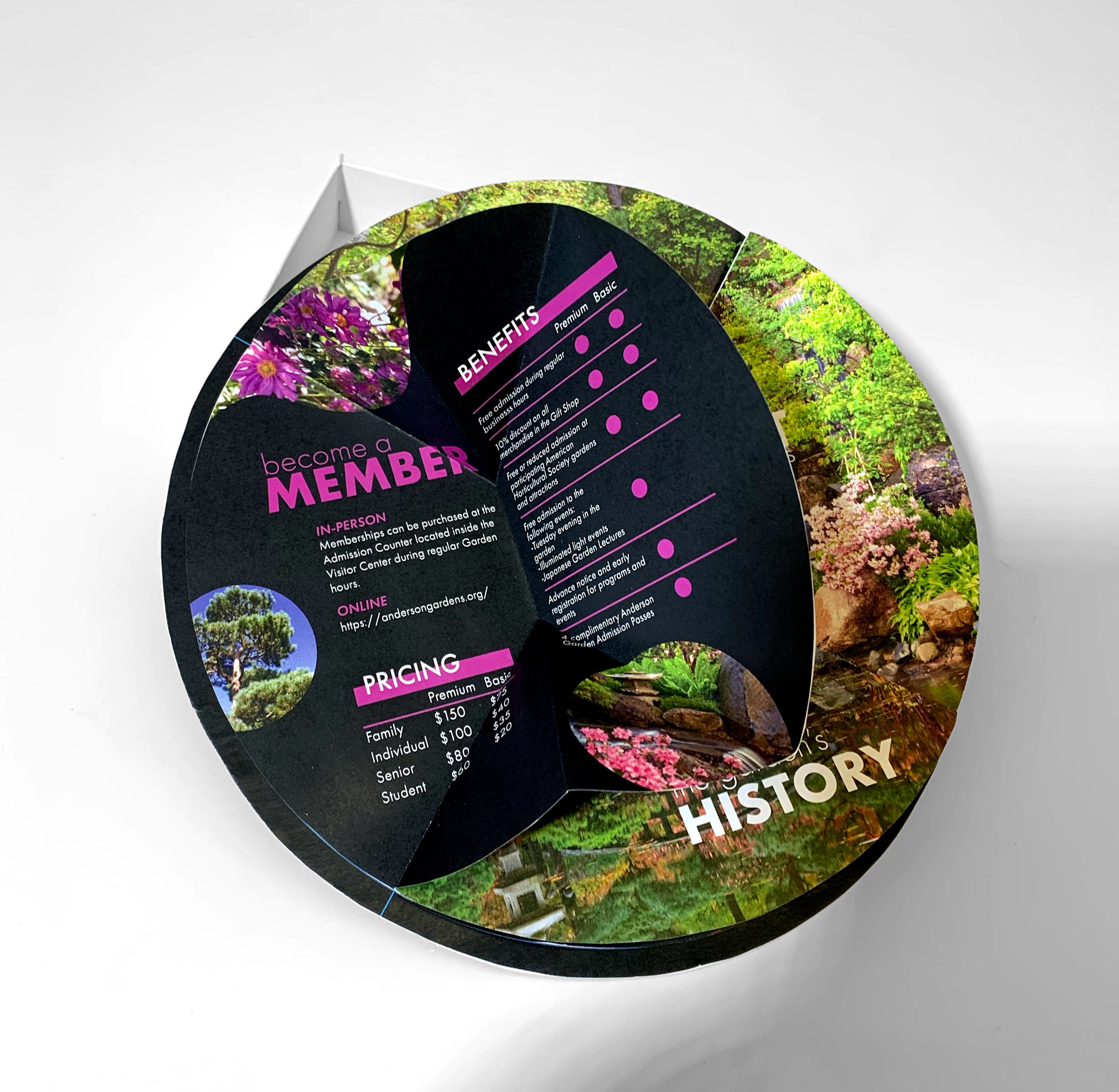
Memberships & Events
Visit information


01. Structure
The Anderson Japanese Garden’s logo is a cash coin, originating in China, which is signified by a square hole in the center. Combining this shape with the interactive process of origami, I designed the structure of the primary brochure to have fold-out sections from a main body with the coin’s shape.


02. Process
Beginning with the garden’s current brand color of red, heavily stylized typography, and Zen Garden lines in the design, it became clear that the visual noise was far too loud. Later versions included a serene blue and toned-down line work before realizing that using black as the main color would allow the landscape photography to remain the star of the show.